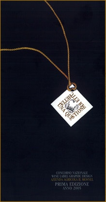
The Premio Mosnel “Questione di Etichetta” (Mosnel’s “The Matter of a Label” Prize) was introduced in 2005, in its first edition. An extraordinary and rare wine, the 1990 Brut, released in an extremely limited edition, was a wine that demanded an exceptional dress. Thus the idea of a competition was born, a kind of divertissement among designers. Thanks to the invaluable collaboration of the ADI (Associazione Disegno Industriale), the competition attracted the most prestigious among Italian designers. In less time than it takes to tell, the organisation machine went into motion, and the result was an impressive competition that design professionals welcomed with great enthusiasm, submitting a high number of imaginative, intriguing projects. The jury examined the works and crowned the winner: the 300 magnums of Franciacorta Brut 1990 had found their label “d’autore”! (For the record books: the winners were the architects Franco Origoni and Anna Steiner of the studio bearing their names.)
QDE PRIZE - 2005
The Premio Mosnel “Questione di Etichetta” (Mosnel’s “The Matter of a Label” Prize) was introduced in 2005, in its first edition.
THE WINNER
Franco Origoni e Anna Steiner
The jury, gathered on September 5, 2005, in Milan, declared as winning label Label A by architects Franco Origoni and Anna Steiner for the overall impact of its communication of the product and for the consistent general coordination of all of its graphic elements, in which the development of a unique format “brands” in a very clear fashion the container surface and the strong value of a “modern heraldry” confers identity upon a prestigious content.
LA GIURIA
President
Giovanni Baule / Director of the journal “Linea Grafica”, Extraordinary Professor of Industrial Design and coordinator of the Communications degree programme in the Design
Jury
- Carlo Forcolini, President – ADI,
- Alberto Cavalli, President – Provincia di Brescia,
- Adriano Baffelli, Director – Consorzio Tutela del Franciacorta,
- Lucia Barzanò, Azienda Agricola Mosnel.
GIANCARLO ILIPRANDI
A more emotional approach, more in depth, more personal.
The designs for the labels were so many, in every format, shape, and colour, and utilising every system of attaching the label to the bottle. The best labels are still paper labels. The contest actually specifies this characteristic, eliminating any possible experimentation. This label is triangular, on paper with a handmade look and the main lettering hot-stamped in gold. Gold-foil lettering like this is never easily readable; the light must fall on it in just the right way. So one must hold the bottle carefully, tilt it, or slightly rotate it. Easy legibility is not an absolute must in our case, since this is an uncommon magnum, in a limited edition, and the collector know what it contains, as do the guests who will be the favoured recipients of this Franciacorta. If we wanted to make the printing easily readable we would print it as black on white. But the wine is well known, and thus the labels become more of a decorative motif rather than a means of identification; it is like the passport of a famous personage. It must be there, but it is useless. Our triangle measures 12 centimetres per side; it is equilateral, of course, to convey the idea of internal balance. Its three corners project themselves in different directions and symbolise dynamic energy. The wording is in Optima, devoid of any manipulation or deformation, and conjures up a vaguely rationalistic classicism. It exhibits a logical sense of reading by utilising a logical division of the component words, and the form of their composition suggests, perhaps as a sub-conscious impression, that of a cluster of grapes. The triangular form could also suggest a glass, or better, a stemmed wineglass, although this is not a wine that one drinks in a normal wineglass. The label has a green background which should blend in with the glass of the bottle. The paper is a large-grained rustic type, but rather sophisticated, and with a distinctive feel to it. The gold lettering is embossed, and one should notice and feel that effect, since the hot-stamped gold has the effect of flattening the grain of the paper. The label contains all the necessary information, including the logogram of the producer, which appears perfectly integrated into the whole. The label is opaque coated, naturally. If a printed label had not been specifically required, metallic letters printed directly on the bottle would be an excellent suggestion. The effect of this procedure could be studied simply by producing an appropriate stencil and printing in off gold on transparent film. Or utilising a silk-screening process. Or even, for a much more sophisticated effect, one can die-cut a very thin silver foil then print in gold, and the writing would wrap on the bottle as a net. Of course, the dimensions could be larger. Presenting these kinds of experimental possibilities would of course require an appropriate expenses reimbursement. Research does have its cost, but it very often is worth the time spent on it. Finally, I take the liberty of making a small suggestion. Since this is a very special type of product, a taste of it during the creative research stage might effectively move that research in the correct direction, allowing a more emotional approach, more in depth, more personal. Mutual understanding seems to be fundamental for an effective communications project.
biography
Giancarlo Iliprandi, currently regarded as one of Italy’s finest graphic designers, first dedicated himself to studying medicine and surgery, then to courses in painting and scenography at Brera, but definitively committed his career to graphic design and planning, specialising in the various aspects of visual communication. He has won many prizes and tributes for his reflections on typographical composition and lettering, and for his creation of typefaces. After teaching at the Scuola Superiore di Pubblicita`, Isia in Urbino, and at the Istituto Europeo di Design, he is currently Professor in the Department of Design at the Politecnico di Milano, which in 2003 conferred on him a degree in Industrial Design Honoris Causa.
ITALO LUPI
Functioning as an impressive heraldic device
Solution A
On the large, elegant magnums of Il Mosel Franciacorta DOCG Brut 1990 RD belongs not a traditional label but, functioning as an impressive heraldic device, silk-screening in gold; in its graphic simplicity, it would immediately draw attention to the excellence of the product. This would be an up-to-date graphic element that ignores nothing; rather, it is a clear reference to the tradition and to the “liturgy,” visual as well, that accompanies the great Franciacorta Bruts.
Solution B
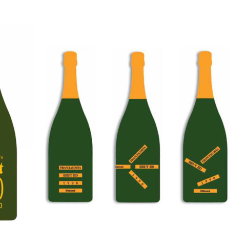
This solution frees the product image from the encumbering stereotype of the label, always a single label, in that position, immutable forever. Without sacrificing anything of the required elegance and of the sensory elements of tradition, which are fundamental to bottles of Franciacorta Brut, one can suggest a physiognomy that will be identical bottle after bottle, but at the same time, bottle after bottle, different as well. Small gilded self-adhesive strips of paper, each one bearing the required information–name, vintage, producer–, allow a free-form application that will be utterly characteristic of each bottle. Each bottle will be thus unique, but recognisable.
biography
Architect, graphic artist and designer, born in Cagliari in 1934. He received his degree at the Politecnico di Milano, where he was assistant to Pier Giacomo Castiglioni. He then became graphics consultant for Rinascente and IBM Italia. He designs and plans images, communications, and signage, and designs temporary exhibition installations and museum spaces. He is art director of Domus, and has served as editor of Abitare since 1992. H. Royal Designer (Royal Society of Art, London). He has had shows of his work in New York, Tokyo, Osaka, Grenoble, and Echirolles.
BOB NOORDA
A label in a vertical format
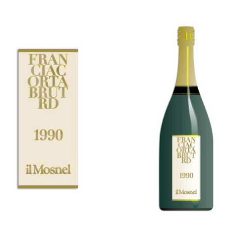
Since we are dealing with a classic and prestigious wine, we have designed a label in a vertical format, 14cm high and 6cm wide (half the diameter of the bottle), executed on straw-coloured laid paper that will have the same tonality of the wine in the bottle. Considering the name of the wine, Franciacorta Brut RD, and in particular its length in terms of the number of characters, it was thought preferable to create a trademark logogram by dividing up the words into a sequence of novel syllables. The logogram in composed in a classic font, Didot. The texts, in gold, would be in slight relief.
biography
Born in Amsterdam in 1927, Bob Noorda obtained his degree there in 1954 at the IvKNO institute. He then began his professional activities in the area of visual communications, corporate design, packaging and product design, and interior design. He won numerous awards and tributes, among them the Compasso d’Oro in 1964 for the signage for the Milan subway, in 1979 for integrated imaging for Agip Petroli and for the symbol and imaging for the Region of Lombardy, as well as the Rimini Gold Medal for his activities in the field of design. He was professor of graphic design at the Umanitaria in Milan and at ISIA in Urbino. In 1985 he founded Noorda Design. From 1996 through 2001 he was contract professor of visual communications in the Department of Design at the Politecnico di Milano. In 2005 the Politecnico awarded him a Laurea in Design Honoris Causa. Bob Noorda died on Jan. 11, 2010.
FRANCO ORIGONI E ANNA STEINER
A hand-written script corresponds to the concept of the bottle as a “unique work”
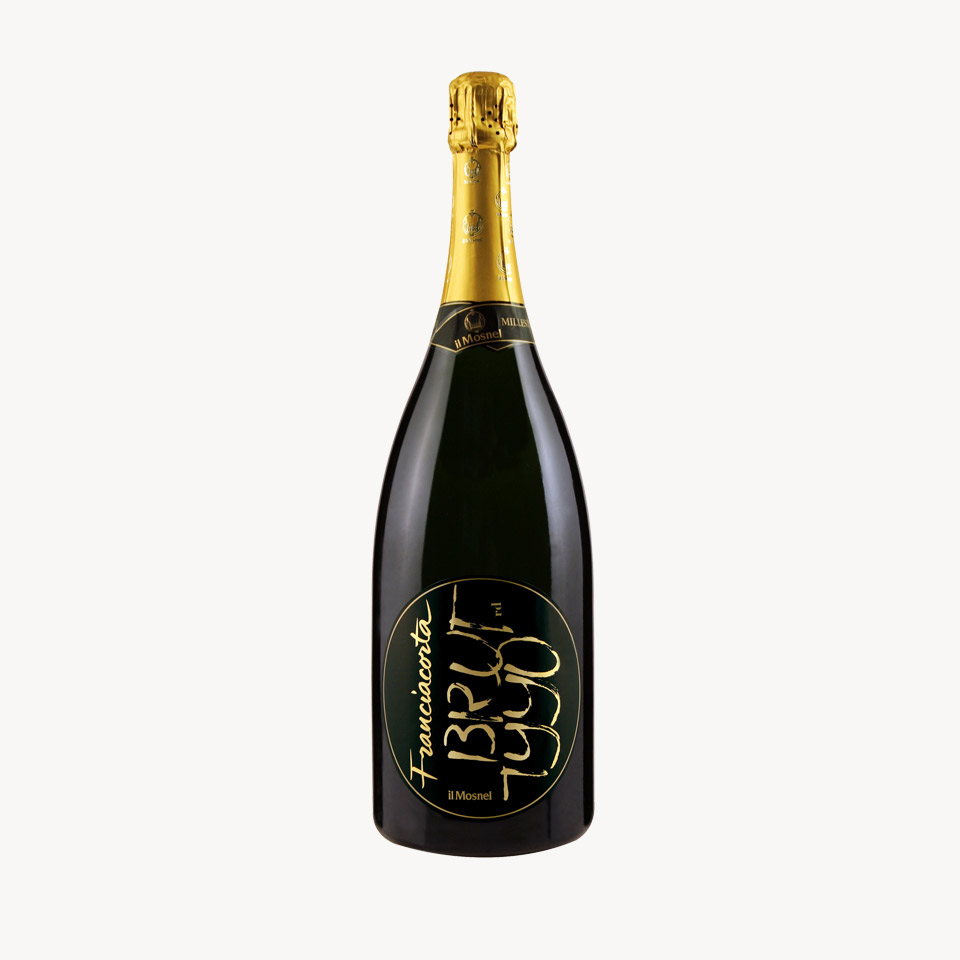
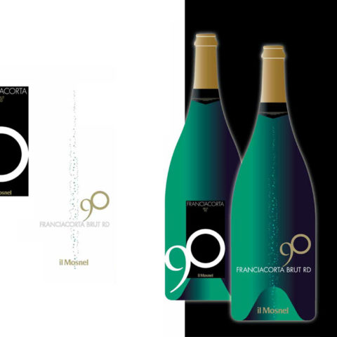
The decision to use a hand-written script corresponds to the concept of the bottle as a “unique work”, which contains an intense sparkling wine linked to an irrepeatable emotion. The sober character of the calligraphic composition, which achieves its aesthetic balance in the relationship between the full and empty spaces, aims to mirror the “elegant taste and great equilibrium” of the 1990 Brut. The immediate accessibility of the script corresponds in turn to the wine’s “lively, appealing palate.” The form emerges from a study of the compositional possibilities, beginning with an analysis of the single shape of each letter, both uppercase and lowercase, and then from the correspondences that emerge from their relationships to each other, as well as from the four numbers of the production year.
Thus we have the harmonious interrelationship between the uppercase letters of Brut and the four numbers of 1990, a correspondence that follows the relationship between the rounded as well as the non-rounded characters and gives a unitary significance to the whole, transforming the sign of the script into a higher-level, distinctive sign-symbol. This can exercise the function of an identification that is the hallmark of a product brand logo, which can accompany the brand logo of the Mosnel company. The use of a circular shape springs from the conviction that the pure shape of the circle, in its classic essence, corresponds as well to a conception that has its roots in Italian Humanism and in the search for geometrical abstractions and golden proportions that derive from a careful study of natural forms. The circle conjures up as well the idea of universality, of the circularity of human experience, of conviviality, of equal distance from the centre, and therefore the most perfect balance. The attachment of the circular label to the bottle transforms it into an oval, which conforms perfectly to the design of the bottle itself, and it could also bring to mind the natural shape of an individual berry. While it may be easy, in the field of visual design, to find high-quality circular labels on the packaging of various kinds of products intended for food service and catering, we do not think this shape has been used on bottles, except in unusual circumstances. For this type of Brut we thought quite appropriate a shape that even in its absolute simplicity would be nonetheless utterly original and distinctive in this commercial sector. Positive- and negative-field variations on special label papers supplied by wine label printers could also be considered, since that would offer a broader choice of possibilities and of printing or re-printing styles. The handwritten script could also be printed in relief, giving an effect of translucence. We believe that a bronzish or gold hue, say Gruppo Cordenons Stardream Wowe 1s Copper WS paper, would be particularly refined and attractive with printing in black, but it presents the disincentive of being “different” from the gilded covering over the cork, so we suggest the possibility of using for it, in the future, the same tonality as the paper, since the combination would be a further distinctive element.
biography
Franco Origoni
Architect Franco Origoni was born in 1945 in Milano, and works with Anna Steiner in the fields of publishing and installations. He teaches in the Department of Design at the Politecnico di Milano, and has directed for four years an installations design studio. He has curated numerous exhibitions on Italian graphics and on design.
Anna Steiner
Born in 1947 in Mexico City, architect Anna Steiner works with Franco Origoni in the fields of graphics and installations. She teaches in the Department of Design at the Politecnico di Milano, and has directed for one year an installations design studio. She has collaborated with numerous publishing houses.
MAURO PANZERI
Per un grande vino si può anche scegliere la semplicità del segno, se accompagnata da un minimalismo elegante

Label A
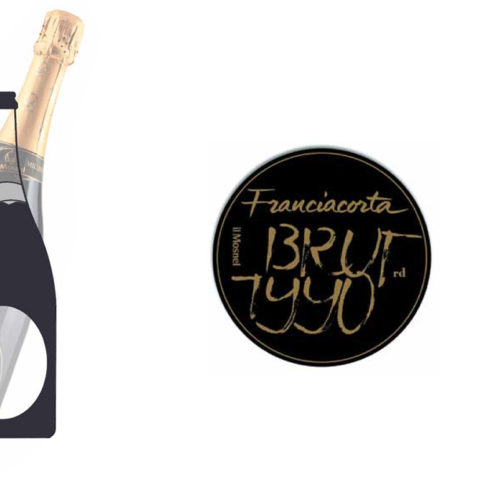
Silk-screen onto the glass a 3-colour composition, white, gold, and black. The matter of a label: for a great wine one can choose simplicity of style, if it is accompanied by an elegant minimalism. This label silk-screened onto the bottle is held within a blacked-in frame that bears the name, the trademark and the number 0 of the production year. The number 9, on the other hand, exits from the frame to shift the axis of the label (and the viewer’s gaze) and to graphically follow the roundness of the bottle and thus to echo and reproduce it.
Label B
Silk-screen onto the glass a 3-colour composition, white, gold, and green. The matter of a label: a great wine can be rigorously interpreted, not ignoring perhaps even a hint of irony. This label silk-screened onto glass has no background field to contain the constituting elements. The production year becomes an offshoot of Franciacorta, while on the bottle’s vertical axis, interrupting the rigidity of the horizontal composition, could be a dynamic touch: the subtle upward movement of the bubbles of the bead.
biography
Mauro Panzeri, aged 50, is a graphic artist who lives and works in Milan. After a degree in Political Philosophy, he worked from 1979 to 1985 with Studio Alchimia, a studio for radical design, as Italian team leader in neo-modern design. He was then editorial collaborator with the design monthly, Modo, art director for the French monthly De´coration Internationale, and then for the international architectural monthly Domus, directed by Alessandro Mendini. In 1986, he launched his own private professional activity, with the opening of GralCo3, a design studio specialising in publishing graphics. He has collaborated and designed for IBM Italia, Domus Academy, Triennale di Milano, Officina Alessi, Olivari, Istituto Europeo di Design, Electa, Edizioni Ambiente, Prenatal, WWF, Cassino, Salani Editore, Barovier & Toso, Longanesi, and Edizioni Ponte alle Grazie. He teaches in the Department of Industrial Design at the Politecnico di Milano and at the Istituto Europeo di Design.

MARIO PIAZZA
The label for a great sparkling wine should be the first invitation to sample it
We thought that the label for a great sparkling wine should be the first invitation to sample it. Thus the label-glass that appears as an elegant shape, emphatically original, in a deep black that highlights the stylish typographical choices, simple but status-laden. A label, an emblem, a simple idea that leaves behind a trace of itself.
biography
Born in 1954, architect Mario Piazza has had his own studio in Milan since 1982, working in visual planning in the field of business and public communications, in integrated imaging, and in the exhibition and special event installations. In 1996 he founded the 46xy studio, specialising in business design and communications, both in terms of planning as well as of strategy and consultancy. Since 1992 he has served as president of AIAP (Associazione italiana progettazione per la comunicazione visiva), the professional group for Italian graphics designers, and member of the international umbrella groups, Beda and Icograda. Since 1997 he has been professor of industrial design for visual communications in the Department of Design at the Politecnico di Milano.

LEONARDO SONNOLI
The main idea behind this project can be rendered by the word uniqueness

The main idea behind this project, coordinated in two proposals, can be rendered by the word uniqueness. The high quality of what is in the bottle, its limited edition, and its custom-design label make every bottle of Franciacorta Brut RD 1990 a unique object. And this project aims precisely at showcasing this uniqueness by overturning the usual hierarchy of elements on a label, which normally concedes only a modest space to the progressive series of numbers, or even consigns it to the back label. Here instead the progressive number of each bottle, considered its number in the edition, itself becomes the label, this underscoring and communicating as the first item of information that this is a unique bottle. The reference to the numbering of multiple copies and of art prints suggests a parallel with the cultural value of the oenological product. But there is a further element regarding the label that exhibits this uniqueness. In version A, the background support of the information, denomination, and numbering is deliberately different on each label, the objective being to achieve backgrounds that are never the same on any bottles. Printing on different papers, selected from the vast number of gift and covering papers currently available, would be done in silk-screen for the black type and in hot-stamped gold for the Mosnel logogram, or both could be silk-screened.
In version B on the other hand, which utilises silk-screening onto white hand-made-like paper, the progressive numbering remains he predominant element of the label. In this case, a gilded frame contains only the number, almost as if it were a work of conceptual art. The references to modern art are immediately apparent in both; not only to contemporary art but to the Fluxus movement as well as to the concrete poetry movement, which certainly serve as departure points and as sources of inspiration to give form to an artefact that is not simply a label but the translation, or better the visual interpretation of a valuable content and of a work artistically produced.
biography
Leonardo Sonnoli, born in 1962 in Trieste, received his degree from the Istituto Superiore Industrie Artifticlie of Urbino and his professional training at Tassinari/Vetta di THcstc studio. From 1990 through 2001 he served as creative director in the Dolcini associati studio in Pesaro, specialising in visual identity for public and private enterprises, cultural event communications, and in signage and electronic communications for public applications. In 2002 he founded CODEsign and, together with Paolo Tassinari and Pierpaolo Vetta, served as art director for the 50th edition of the Biennale di Venezia. He has won prestigious tributes, among them the Silver Medal at the Toyama (Japan) Triennale and Mention of Honour at the ADI XIX Premio Compasso d’Oro. He is one of the 14 Italian members of the AGI (Alliance Graphique Internationale).
HEINZ WAIBL
Il “tetto” sotto il quale si produce il nettare degli dei

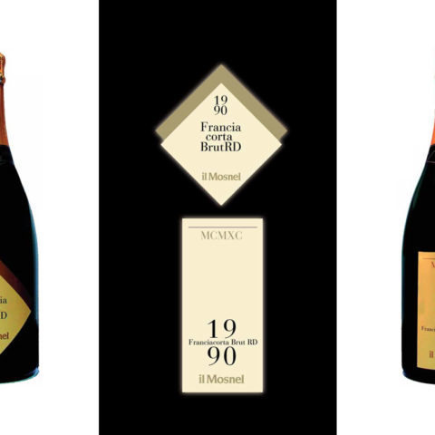
The characteristic element is an architectural shape that is meant to represent the “roof” under which the nectar of the gods is produced. In this version, the vintage year is graphically presented in an original way, as is the name of the wine, in order to increase the distinction and memorability of the label.
The vertical format, as well as graphic style, is well suited to highlight the scale of values of the information: the vintage on top, in Roman numbers, to underscore the product’s classicity and to confer increased importance on the year, whose “month of September was the best in human memory.” The 1990 becomes, in the body of the label, the graphic element that encloses the name of the wine. As can be seen, we have identified in the vintage year the label’s main graphic characteristic and the chief determining factor, since the other informational elements are of a recurring character.
biography
Heinz Waibl, of Middle-European origins, was born in Verona in 1931. Liceo artistico and two years’ study of architecture at the Politecnico di Milano. Student, collaborator, and assistant of Max Huber in the 1950s, he worked for 20 years with Castiglioni, which culminated with the stands designed for Bticino at the Intel of 1985, 1987, 1989, 1991. From 1967 to 1971 he worked with the Unimark Int. Corp in Chicago and in Johannesburg, South Africa. Upon his return to Italy, he occupied the chair of Visual Design at the Scuola Politecnica di Design in Milan. In 1947, with Laura Micheletto, he founded Studio Signo in Milan, which is still active; he quickly attracted prestigious clients from both private and public sectors. His works were published in of the most influential graphics journals across the globe. He authored Alle radici della comunicazione visiva italiana, which became a fundamental text in the study of graphic design.