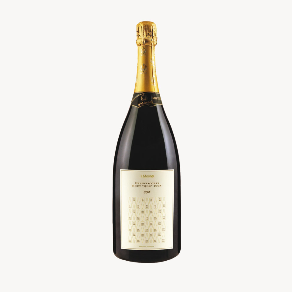
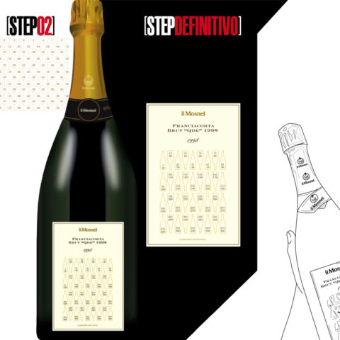
The star that emerged in 2008 was Franciacorta DOCG Brut “QdE” 1998, fruit of yet another extraordinarily good growing year and therefore another vintage in search of packaging that would underscore its exceptional qualities. Again with the support of the invaluable ADI, from the marriage of design and an extraordinary wine emerged another collector-calibre edition.
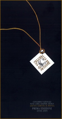
QDE PRIZE - 2008
Three years after the first edition in 2005, a new cuve´e made its debut, every bit as prestigious and still in a limited series of 360 magnums.
THE WINNER
Hangar Design Group
The linearity of the project confers upon the bottle significant stylishness and refinement, bringing into being an object of sober elegance. Its use of chromatics and tonalities exhibits a careful study that is meant to ensure continuity with Mosnel’s brand image and production philosophy. Of particular note is its proposal to execute a manual operation on each bottle with respect to the numeration, an intervention that underscores the exclusivity of each piece as well as the artisan-quality attention that each bottle is given, thus bringing to the fore the aspects of uniqueness and of individual identity of the product.
THE JURY
President:
Daniele Cernilli / Director, Gambero Rosso; Editor, “Vini d’Italia”, by Gambero Rosso-Slow Food
Jury
- Architetto Carlo Forcolini / Past President dell’ADI
- Professor Carlo Branzaglia / Professor Accademia di Belle Arti di Milano and of th Politecnnico di Milano
- Chiara Medioli / Direttore Marketing Fedrigoni Spa
- Dottor Adriano Baffelli / Director, Consorzio Tutela del Franciacorta
- Lucia Barzanò / Azienda Agricola il Mosnel
THOMAS BERLOFFA
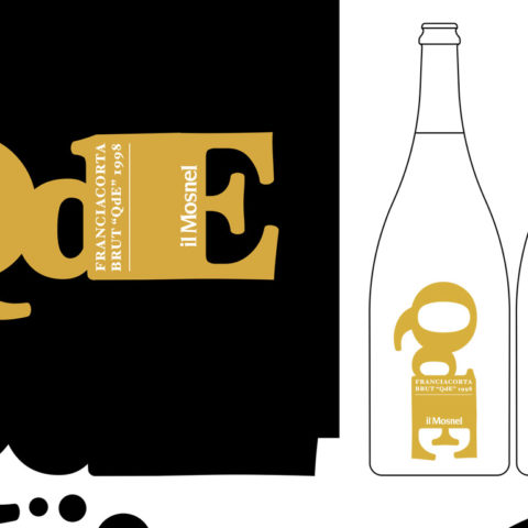
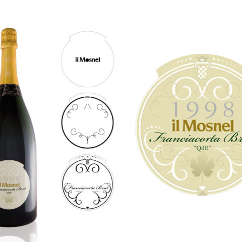
The three letters QdE become the label, creating and original and strongly recognisable form. The characters are engraved on the paper by a laser. The result is elegant, and respectful of the great Mosnel tradition, achieved with avant-garde technology.

The three letters QdE become the label, creating and original and strongly recognisable form. The characters are engraved on the paper by a laser. The result is elegant, and respectful of the great Mosnel tradition, achieved with avant-garde technology.
biography
Thomas Berloffa works in graphics planning and web design. His clients include: The Foreign Ministry, the commune of Milan, Promos-Camera of the Chamber of Commerce, Milan, the Italian Postal System, Cassina, L’Oreal Italia, the Triennale di Milano, ADI (Asociazione per il Disegno Industriale), Danish Museum of Art and Design, 01 istribution, EMI Music, Design Museum of Helsinki, ICE Atlanta, ICE Moscow, FederArgenti. His projects have been displayed at: The Biennale dei giovani del Mediterraneo (Torino, various venues); Le citta` invisibili; the New Italian Design (Milan, Museo La Triennale di Milano); XX Compasso d’oro (Milano, The Triennale di Milano); Geneva, WIPO; Tel Aviv, Shenkar College; La dolce vita (Stockholm, Milan, Dubai, Barcellona, Budapest, various venues). His various award include the most prestigious; recognitions for three projects in ADI DESIGN INDEX 2003 and 2004; Recognition of Honour at the XX edition of the Premio Compasso d’Oro ADI.
STEFANO CASTIGLIONI
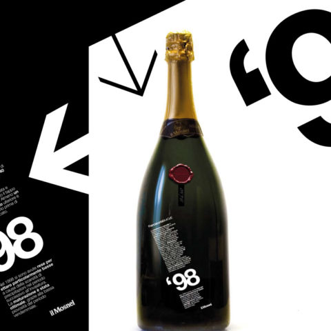
Visually, the fulcrum of the label is the vintage year

I decided to create a graphic sign, beginning with the printing, that would privilege information useful to the user, in the most informal manner possible (a label can be defined as something placed on any kind of container that identifies and describes its contents) and avoiding those “romantic” descriptions of perfumes and wine and food combinations that I believe to be completely subjective. Visually, the fulcrum of the label is the vintage year. This choice is dictated by the fact that a Brut of 1998 deserves to be made important. The typeface used for the texts is a Helvetica, in all of its variations (Thin, Light, Regular, and Bold). I am in agreement with others that everything can be expressed in Helvetica (“I love you” written in Helvetica Bold is very passionate, while in Helvetica Light it is very delicate). The size of the label, and its angle, are indicated by the golden relationships presented in nature. Tampography, which ensures high-quality printing results even with very small, thin characters, combined with the seal wax and the hand-written strip of paper, accentuates the impression of uniqueness for the product.
biography
Stefano Castiglioni, a 30-year-old freelancer, left a brilliant career as a lawyer after being struck by a passion for visual design. He received his degree at the Istituto Europeo di Design, then began his professional activities in 2002, after winning the Premio Faar-Csar for his 50-minute medium-length film on the history of Italian design. In his still-short career, he has participated in numerous projects, and has collaborated with great masters of Italian graphic design, such as Bob Noorda and Giancarlo Iliprandi. Since 2004, he has served as art director for a prestigious journal of office landscapes. Recently, in collaboration with Italo Lupi, he has been involved in the creation of visual identity for events that are part of the 21st annual Premio Compasso d’Oro ADI. He is co-founder of Aquapotabile, a company involved in visual communications linked to the tertiary sector and to social concerns, and of Il Vespaio, a creative studio involved in the creation of low environmental-impact publicity tools.
HANGAR DESIGN GROUP
The function that a label plays is that of recognition, of attraction, of production identification

When we received the invitation to propose the graphic appearance of a product so refined and impressive as Mosnel, we welcomed it with particular pleasure and interest. The function that a label plays is that of recognition, of attraction, of production identification; it is a certificate of assurance and a commercial announcement, but at the same time is must also be itself the definition of a style, the construction of an image, the search for distinctiveness and the expression of a refined and appealing sense of taste. As far back as antiquity, the use of such “signs” has been the source of fascination and curiosity; many are those who have set their talents to creating them, fashioning them not simply into informational tools but into graphic elements, small glimpses that offer one pictured information linked to the places, the history, and the concept of wine. They have been small art works that both decorate and, with the passage of time, become elegant and refined collectors’ objects. With regard to our proposal, we asked ourselves what we wanted to achieve with it, what we wanted to convey. We surveyed different methodologies; we asked ourselves how we could make it compel attention to it, so that it would be unique while all the time preserving a traditional imprint that would faithfully reflect the brand it represented. Mosnel Franciacorta stands out for its production of only 360 numbered bottles in the magnum size, and it was precisely on this concept of a limited edition that we centred our attention. Right from the first, we tried to distinguish the graphic motif from the overall concept, subdividing the project into two steps. We asked ourselves what the idea was, the symbol, that more than any other would represent il Mosel using this number series. We then focosed on the concept of limited reproduction, which contributes to increasing the appeal of the label in the eyes of the collector and adds to its value. This idea is expressed not only through the graphic symbol of the bottle (a simple intuitive sign but explicit as well in its meaning), but through numerical representation as well; just as the real bottles contain wine, so our small reproductions contain within themselves this series of numbers. Those who purchase one of these bottles come into possession not only of wine but of a unique object, and by so doing they gain entrance into a small, select universe of connoisseurs. For the graphic explication, we were inspired by the sensory properties of the wine itself, a wine whose bouquet is evolved and complex, but at the same time delicate, with a dry, full palate displaying a crisp vein of acidity expressing finesse and elegance. This led us to create a graphic expression that preserves a clear, coherent visual identity combined with an image that reproduces the idea of tradition used by Mosnel, thus guaranteeing brand recognisability to the observer through use of the same typeface and colour classic to the brand. Cleanness, definition, and tradition are thus reinterpreted in a contemporary key. Finally, we propose for the label a special paper, which is often used in the wine industry because of its very high-quality and technical characteristics; it can be treated in various ways, in fact, that will made it humidity- and ageing-resistant, ensuring that it holds up well over time. Its pale colour references Mosnel’s traditional labels.
biography
The Hangar Design Group was founded in 1980 by two architects, Alberto Bovo and Sandro Manente. It gathers together under a single title different sections that deal with company communications, graphics, and retail and interior design. The international thrust of the group has resulted in the establishment of an office in New York and, a few years later, of that in Shanghai, and in the presence at the group’s headquarters of team members from many counties in Europe and from the United States. The group is composed of highly-qualified professionals and a staff of Italian and international collaborators boasting in-depth, sector-specific training and expertise who offer creative, technical, and business consulting for high-profile projects and in complex environments. Hangar Design Group has assisted, and continues to assist, Italian and global companies in positioning themselves or strengthening their foothold in the market. The Group specialises in the design and management of multi-dimensional projects, striving always to find the type of intervention that will strengthen the identity of the enterprise, its position vis-a-vis its competitors, and its future growth scenarios in its field. Hangar Design Group displays a remarkable gift for creative design and planning. Over the past few years it has deepened its experience on many fronts, particularly in the areas of advertising, business communications, and brand image.
MONICA GIORGETTA
A recurring visual element on all of the labels of the current wines in an the overall corporate image

The form
The round shape that frames the coat of arms above and the frieze or flourish beneath have been preserved on the label, since they are components already present on the gold capsule and on the black neck label. The round shape constitutes an important visual reference in the integrated il Mosnel image, they are a recurring visual element on all of the labels of the current wines in an the overall corporate image. Those elements have been re-sized in view of the dimensions of the label and of the magnum bottles.
The image
The image is constituted by a symmetrical graphic decoration in which the shoots, tendrils, and buds make up the visual part of the label, framing and showcasing the text, which then assumes the function of completing the visual. The Mosnel logogram, in the centre, is the lead element in the graphic composition. Counterbalanced by the heraldic motif is the leaf, which almost emerges from the label’s delicate background colour and is enclosed by a delicate, light-coloured tendril in raised relief. Small, idealised grape berries, in diminishing sizes, bring to mind the wine’s delicate mousse and lively bead of pin-point bubbles.
The printing
The light background colour, a warm ivory, on the light surface texture of the label, relates to the golden colour of the capsule and of the Mosnel logogram printed in opaque gold, while the name of the wine should be in dark green, the colour of the glass of the bottle. This is a “tactile” label, on which the die-stamped, opaque white reliefs of the shoots and buds interweave with and retreat into the more delicate relief, shiny and more cheerful, of the tendrils positioned over the leaf, in the centre. This particular arrangement, the shiny raised print, gives the label a luminosity that goes beyond that conferred by gold print of the logogram.
biography
In 1985, Monica Giorgetta joined the Franco Gaffuri agency in Milan as a Graphic Designer, where she managed communication projects for IBM, Boehringer Farmaceutica, Ideal Standard, Modit-Sistema Moda Italia, and Condorelli Industria Dolciaria. She won numerous awards for the agency, including Gold and Bronze Medals from the Art Directors Club Italiano and a nomination from Art Directors Club Europeo in the packaging category. In 1993, together with Luca Casotti, she founded Agenzia Ideogramma, which specialises in communications in various fields, including pharmaceuticals, cosmetics, information technology, human resources, and publishing. Among their many Italian and international clients are SAP, GlaxoSmithKline, Roche Diagnostics, Hay Group, Farmafactoring, Beiersdorf, DMC Filati, Deborah Cosmetici, and the French Tourist Bureau. Agenzia Ideogramma has been a member of ADI (Associazione italiana Disegno Industriale) since 1999
TOMMASO MAGGIO
The gold and the transparency combining to create a rhythmic lightness
Completely round 01
The purpose of this label is to highlight the vintage year. The 1998 is what is designed to be captured at first sight, with the gold and the transparency combining to create a rhythmic lightness that prepares for the tasting enjoyment to follow.
Completely round 02
Black and Gold in a marriage of light/opacity–I need no other information–, high quality tattooed onto the skin of the bottle. A strong concept, an expectation that can wait no longer, with nothing further to do except open and taste.
Completely round 03
Elegance is the primary objective of this label, which allows itself the luxury of counterpointing shiny black with opaque black. The Mosnel logogram benefits, through capturing the eye at first glance, with the small white text marking time out of time.
Completely round 04
Echoing the classic colours of the sparkling wine bottle, the laid paper is a delicate foil to the shiny/gold 1998 and to the words Mosnel…divided by a text in grey, in sum, a label to caress, a seal of great quality.
Tactile notes
The idea is to make the visual impact with the bottle an occasion of compelling curiosity. Thus the choice of using the Braille alphabet. One must come up very close, touch it, bring it close to the eye to really understand it fully. An interplay of surfaces that work on two levels, optical and tactile… perhaps enigmatic at first glance, but certainly elegant, to underscore a brand that has no need of explanations to undeline its excellence.
biography
A Milan-based design observer, Tommaso Maggio is the co-conceiver and author of the blog www.lospremiagrumi.com “100% juice and pulp of design.” He is editorial collaborator for Ottagono and other design journals, as well as strategic communications consultant for professional studios and institutions. He is Visiting Professor at the Istituto Europeo Design IED, and at the Nuova Accademia Belle Arti, NABA. From 2002 through 2006 he served as art director for architecture, design, and fashion journals (Activa, Ddb, Lifestyle DDN). www.laboratoriomizar.com.
STEFANIA SCARADOZZI
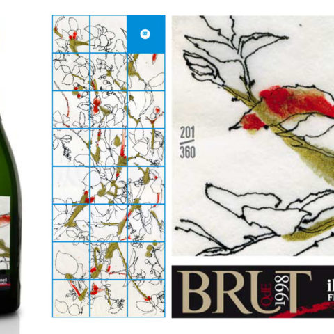
Gilles Cle´ment and to his creation of the concept of the “Terzo Paesaggio”

The history of the word Mosnel, linked to the reclamation projects carried out by the Cistercian monks, bring us back to the analysis by Gilles Cle´ment and to his creation of the concept of the “Terzo Paesaggio” (Third Landscape). To start from a particular work in order to recover the history of an entire growing area and therefore of a wine, to divide the work into 360 equal sections, to create totally unique labels that make up together a unique whole–this is the overall concept of the label. Art and Wine is a classic binomial, but it should not be simply taken for granted, for the innovative and unexpected thrust of sectioning up an art work to then confer uniqueness and equal dignity to each bottle emphasises and concretises the individuality of the sign without deforming or contradicting the brand. Inside the package holding the bottle would be inserted a silkscreened copy of the overall artwork, with a number corresponding to that on the bottle, thus achieving a perfect equilibrium between the limited series of bottles and the limited series of artworks.
biography
An image designer, Stefania Scaradozzi has focused her experience primarily in the activities of communication of a project. She worked as assistant to Massimo Dolcini of Dolcini Associati. Among the projects that she has developed were co-branding Walt Disney and TVS, Imatec’s new packaging, communications for Biblioteca San Giovanni (honoured in Adi Design Index 20040, Aerdorica’s trademark and its User Manual (also honoured in this year’s Index). She also oversaw the business partnership between the Dolcini Associati studio and JWT, in both the Rome and Milan venues. She served as junior art director in the Gruppo Lube, created for them a new corporate identity, and worked on the development of new products. At the same time, she directed Mercatone Uno’s Merchandising del Mercatone Uno di Prato project, where she contributed to the planning and installation of the photography sets and of the exhibition spaces. She directed, among other projects, the PensieriProgetti pilot project for the Gruppo Loccioni and the Master in Design Engeenering “dal Pensiero all’Oggetto dal Senso alla Forma for the Universita` Politecnica of Le Marche. She has planned and coordinated numerous conventions, including “Relazione tra Moda e Design: progettare ’Immaginario” (Ancona 2004) and “Cina, opportunita` o minacce” (Ancona, 2005), Teatro delle Muse.
MONICA ZAFFINI
he Italian typographic tradition furnishes the source of inspiration for communicating a wine of great class and elegance
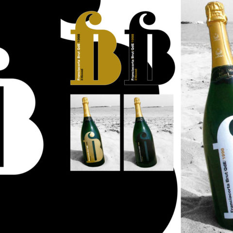
The Italian typographic tradition furnishes the source of inspiration for communicating a wine of great class and elegance, whose primary qualities are tradition and quality. The proposed label is entirely based on coupling (stylistic ligature) the letters “F” and “B”, the initials of Franciacorta and Brut. The shape of the F recalls classic tradition, utilised starting with the Bodoni poster (Giambattista Bodoni and Chauncey H. Griffith, 1790), while the “B” is more geometric, essential, and contemporary. The two letters are joined together and united so that they form a single container, a new geometric shape, a sign with the strong die-cut visual and form-al impact that the typeface exudes. The textual element, designed vertically, becomes a metaphor for the sparkling wine bubbles that rise from bottom to top. The typeface selected for the composition of the “service” text is Helvetica Neue (Max Miedinger, 1957), a “modern” classic that integrates pleasingly well with the gentle lines of the “FB” container. Even the choice of colours privileges tradition and sobriety. Black and white are classics of typography. The gold conjures up the colour of the wine, and is the symbol/synonym of the value, rarity, and elegance of a refined artistic taste. Cin cin! A toast to tradition, to typography, and to good wine!
biography
Monica Zaffini, with a degree from the ISIA in Urbino, boasts lengthy professional experience, from 1989 through 2005, with Dolcini Asociati, the communications agency put together by Massimo Dolcini. In 2005, together with Massimiliano Patrignani, she launched ma:design, a variable-geometry creative workshop that works in corporate imaging, and in integrated communications projects for public and private entities. The achievement of ma:design have been covered by many sector reviews and expositions, both Italian and foreign.